Intro
PosterMyWall is a Silicon Valley-based online graphic design and marketing platform. Founded in 2010, it is self-funded, profitable, and growing at breakneck speed with monthly traction of +6 million from all around the globe.
Problem Statement
The Product Design department at PosterMyWall comprised one other Senior Product designer and had just been initiated one year prior to my joining. There was no formal design system in place and a lot of product design work was being done, well, by intuition. This was a source of frustration for not only the designer but for the engineering department as well.
Why a Design System?
A Design System is a collection of principles, components, and guidelines that aid in the consistent creation of a product's user interface. The implementation of a Design System has several benefits, including increased efficiency and speed in the design and development process, better collaboration between teams, and improved user experience through consistency in design language. It also facilitates easier maintenance and scalability of the product, as updates can be made to the design system and reflected across the entire product. In short, using a Design System leads to a more cohesive and effective end product, saving time and resources in the long run.
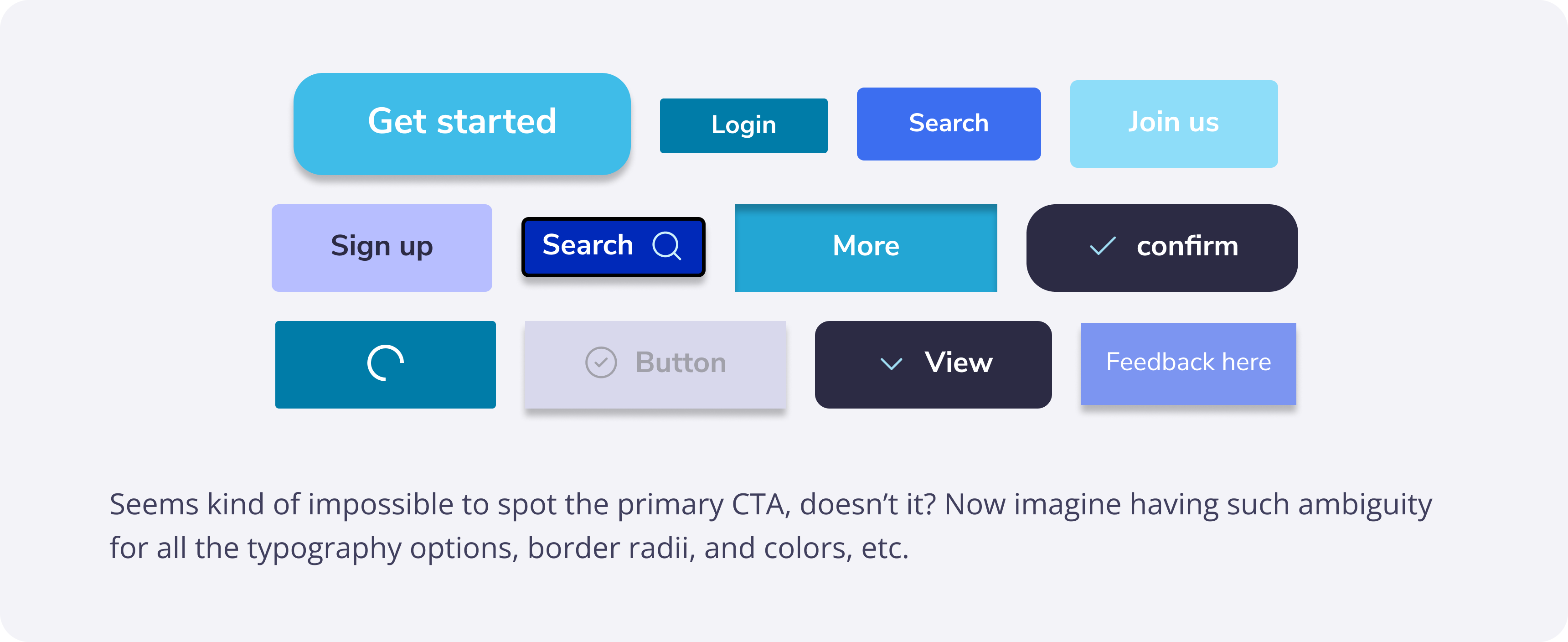
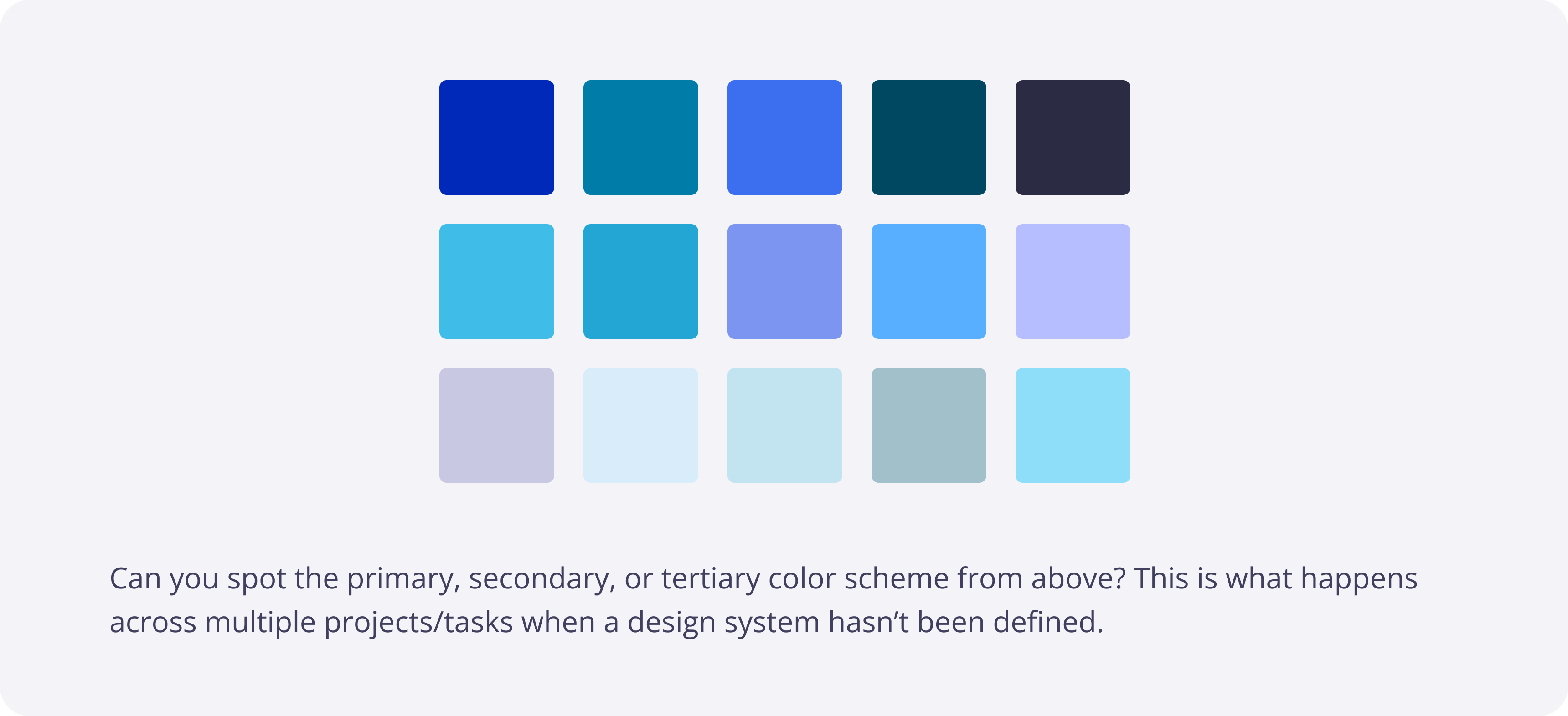
Below are two examples of how things can go wrong when there isn’t a cohesive approach to design. Something along the same lines was being faced by us in different areas but not of as high intensity.
Constraints
A few constraints that our Product Design team was going to face were as follows.
- Being able to convince the stakeholders on how and why there should be a Design System in place.
- Managing the daily tasks in parallel with the Design system and dividing available work hours accordingly.
After having a detailed discussion around the topic, the stakeholders thankfully, instantly agreed with the idea and gave us the green signal to go for it. Since they too were aware of the prevalent problems that came with not having a consistent design language.
For the time allocation, we decided to have a single day from every week dedicated to the Design System. The decision was made after having a few discussions internally and with the stakeholders.
One day per week wasn’t something ideal, but considering the usual frequency of the rest of the design tasks and projects, this was the best that we could get our hands on. Having only two Product Designers, one day per week and a huge list of Atoms, Molecules, etc to cater to, this was a project that we were willing to take on for a longer run.
Process
Starting out with the Atoms, the approach we took up was both the Designers doing research about the best practices of the Atom we had taken up. Every Atom, Molecule, Organism, etc would have its own separate Figma page. The page would contain the complete end-to-end documentation and the relevant Figma component. Documenting the complete thought process and research would not only help us in keeping a track of why we took a certain decision, but also be of great help to any other Product Designers that join the team in the future.
At the end of the day, both Designers would get their heads together and discuss the documentation along with the best practices and review each other’s work for any further ironing. Over time, the process became even more collaborative and proved to have greatly helped with not only reducing any friction that used to occur between the design team itself but also optimizing the workflow by almost diminishing the constant iterations of going back and forth with the reviews and feedback incorporation.
Accessibility
PosterMyWall already had an integration with Userways.org to tackle any accessibility-related queries. Despite that, since the foundations of the new design system were being laid, it was our responsibility to make sure the visual design catered to anyone and everyone from all around the globe.
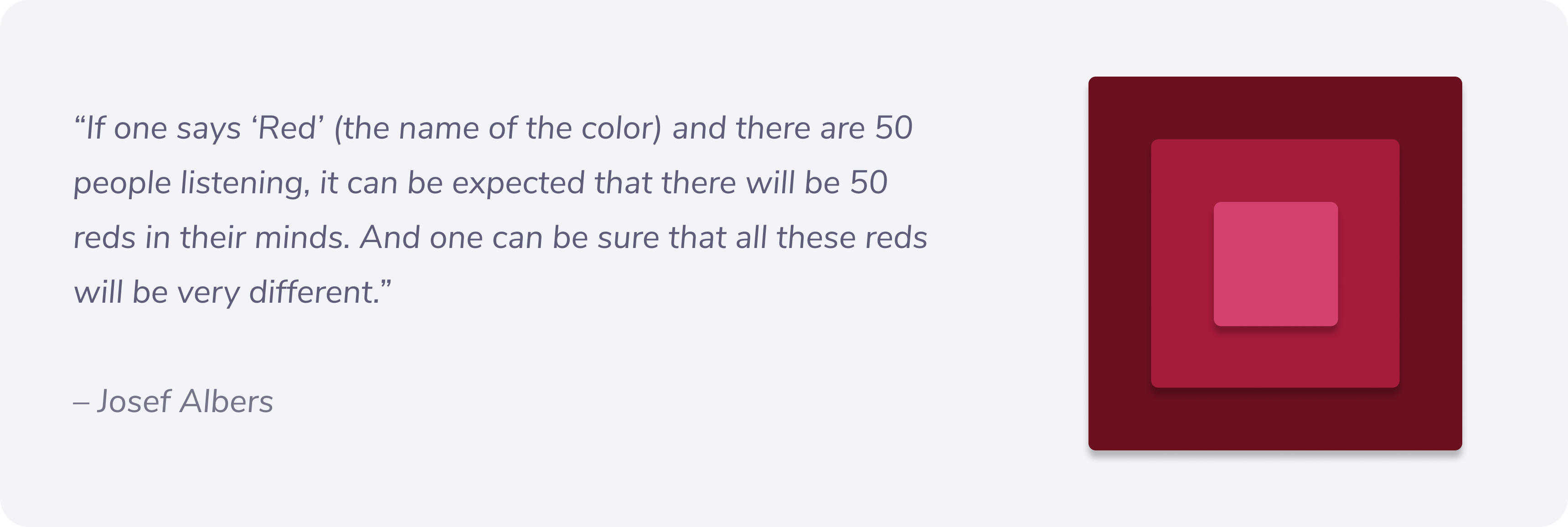
To bake accessibility into the design system, I took upon myself the responsibility to read through and document all the accessibility guidelines. The goal was to:
- Document the guidelines to be followed
- Conduct a UX audit for areas we had already been failing at w.r.t the accessibility guidelines
UX audit results
Since it’s an ongoing project, I’d be able to share only a brief summary and not many details of the results due to confidentiality reasons.
A few areas that had been identified and needed work in regards to accessibility included some parts of the official color pallet that was being used both for branding and visual purposes, plus a few other major visual components that had quite a frequent usage across the platform.
Key learnings
There are 3 major focus areas when it comes to the accessibility guidelines.
- Color contrast
- Keyboard navigability
- Screen reader navigability
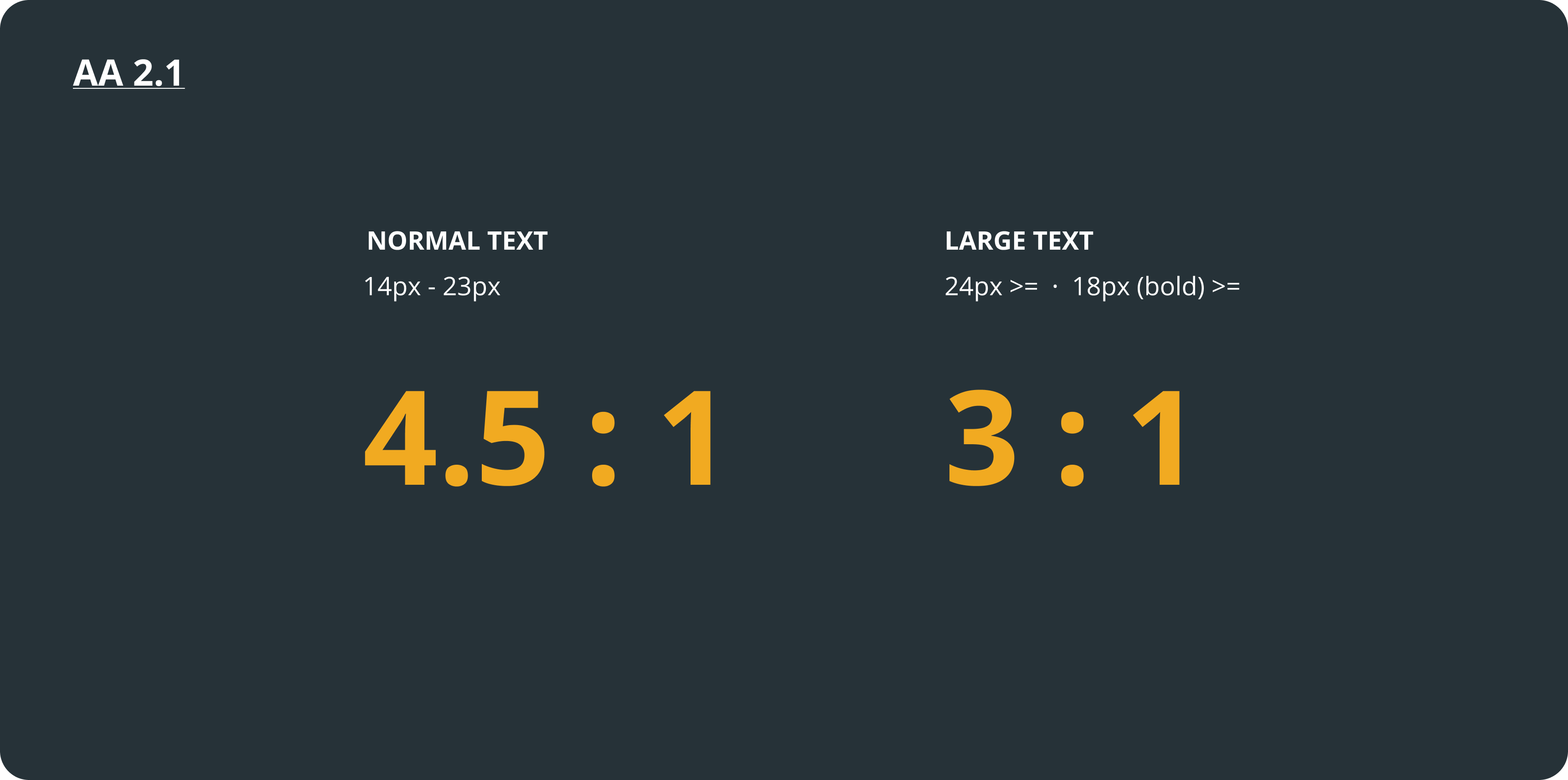
For the Design System, color contrast was the relevant option to focus on for now. To comply with the Web Content Accessibility Guidelines AA 2.1, fonts and typefaces of all sorts need to always have a color contrast ratio of at least 4.5:1 (AA) for normal text and 3:1 (AA) for larger text.
Exceptions
- WCAG does not require contrast scores for disabled items.
- Placeholder text must also follow the contrast ratio guidelines
- Text that is part of a logo or brand name legally does not have to follow a minimum contrast requirement.
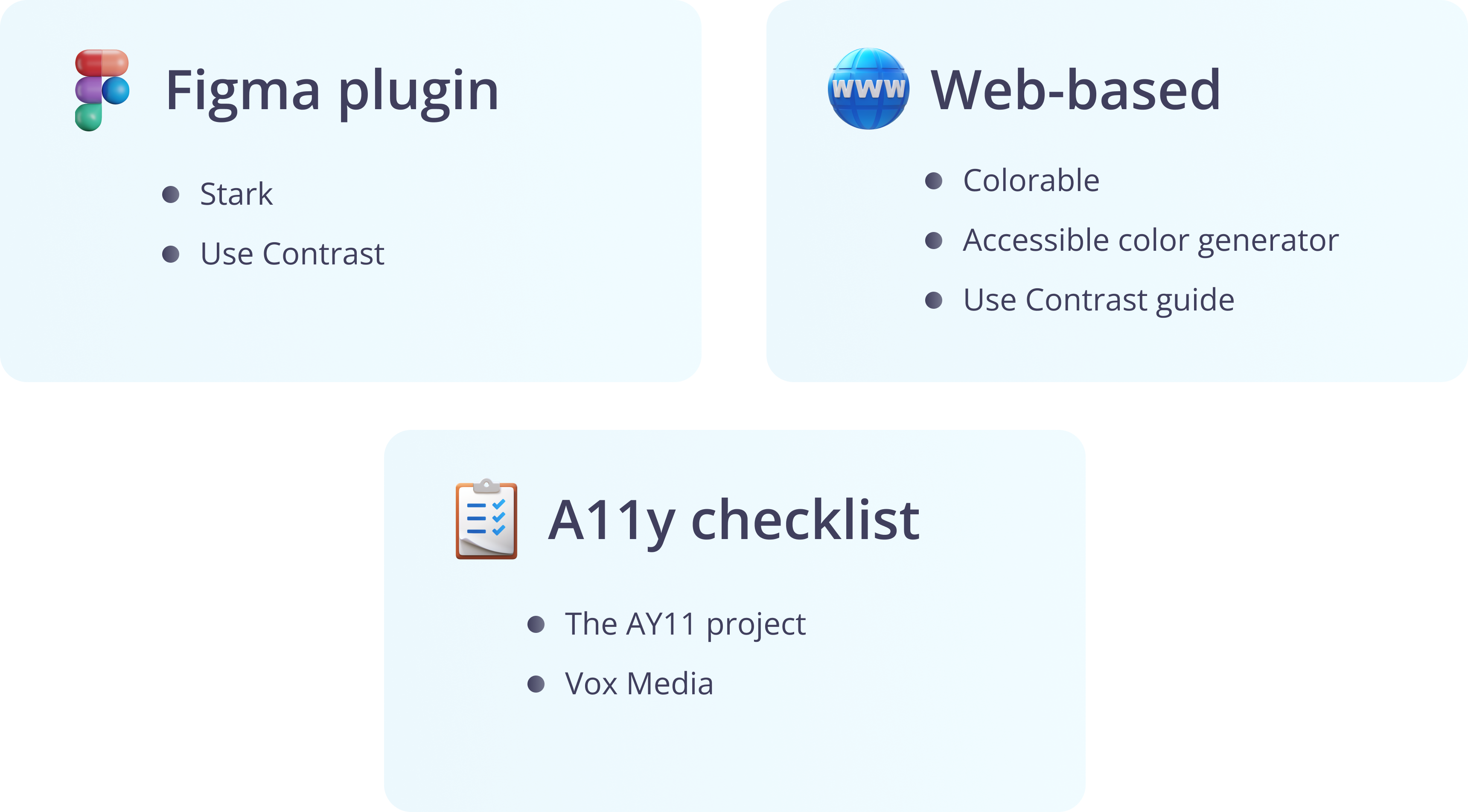
Useful resources
PMW's Design System
For the hierarchy and structure of the Design System, after much discussion, we went with Brad Frost’s Atomic Design model. Initially, there was a bit of struggle with the names like Organisms, but everyone eventually not only got the hang of it, but the Engineering team started using the same naming conventions for their React components!
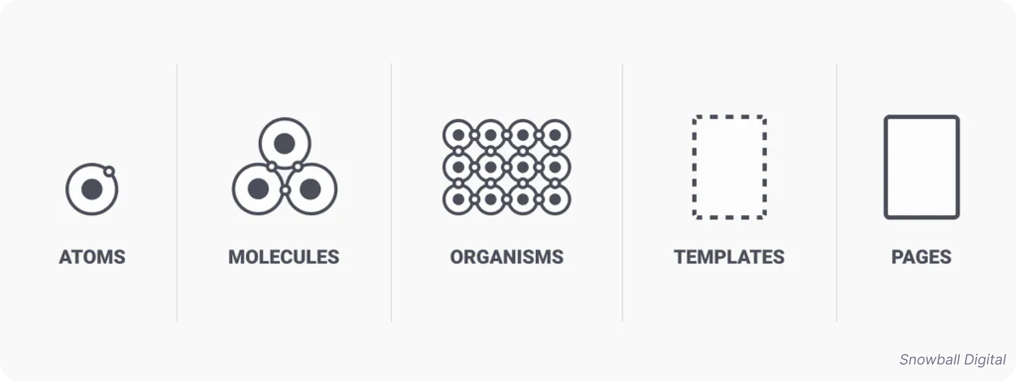
As Brad writes:
“Atoms can also include more abstract elements like color palettes, fonts and even more invisible aspects of an interface like animations.”
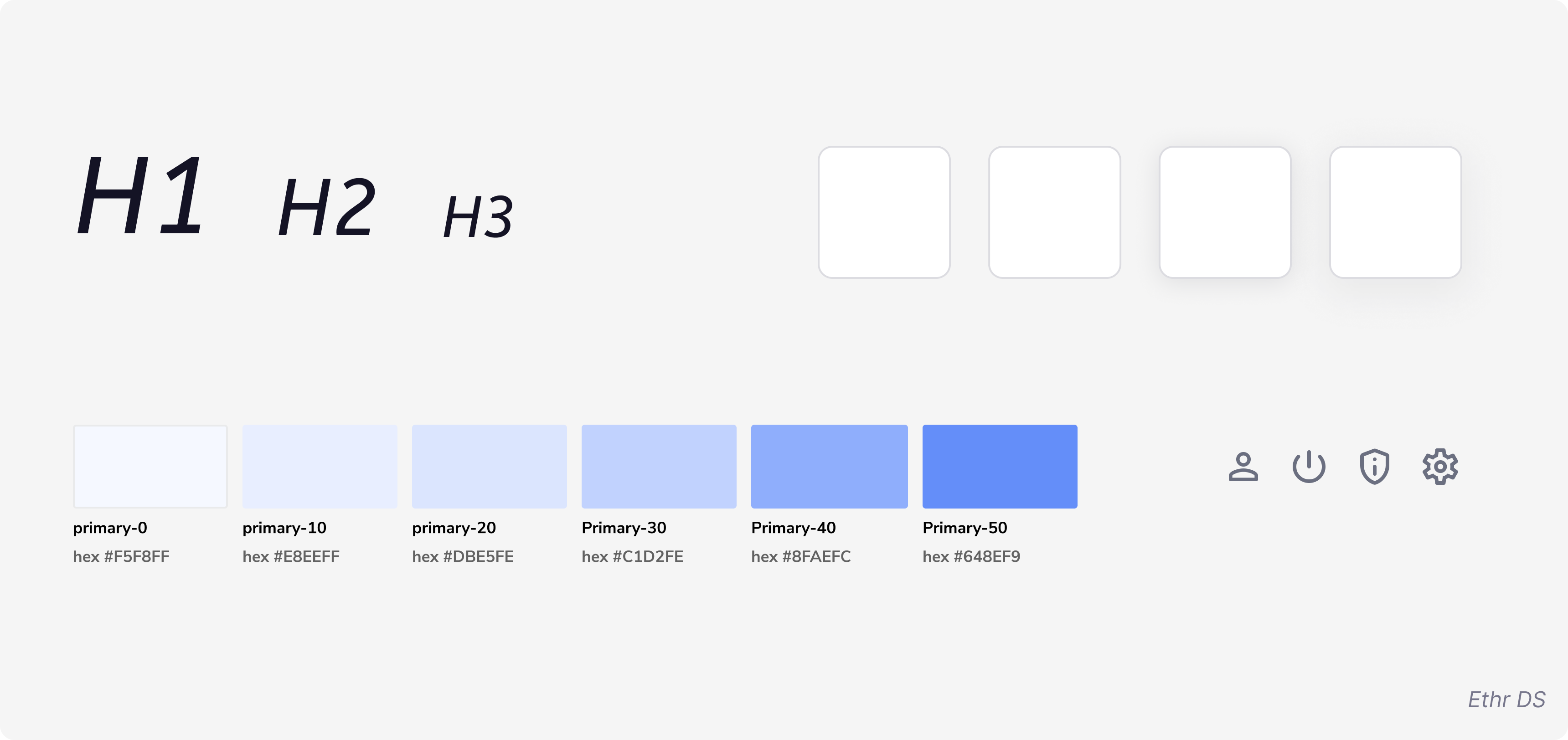
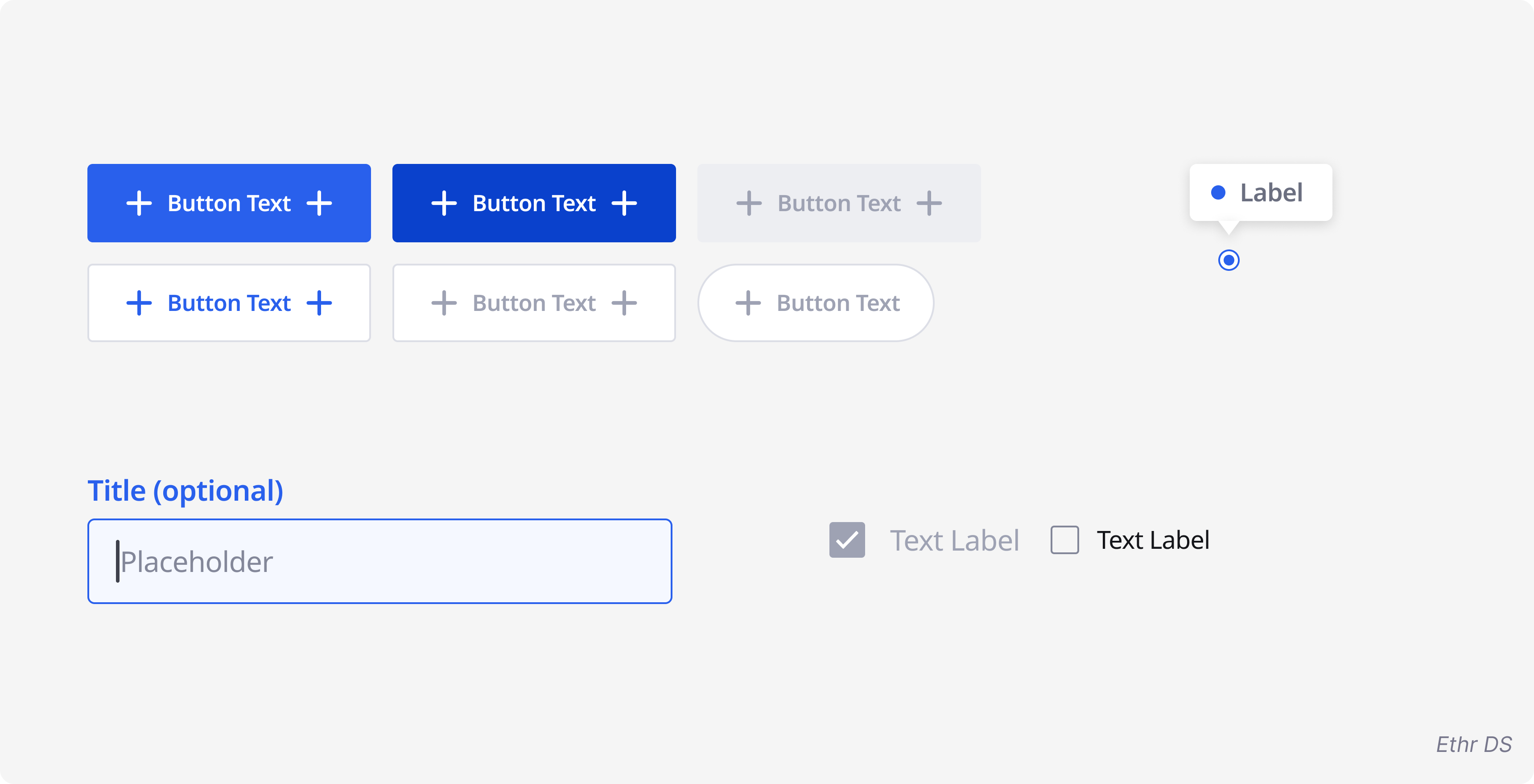
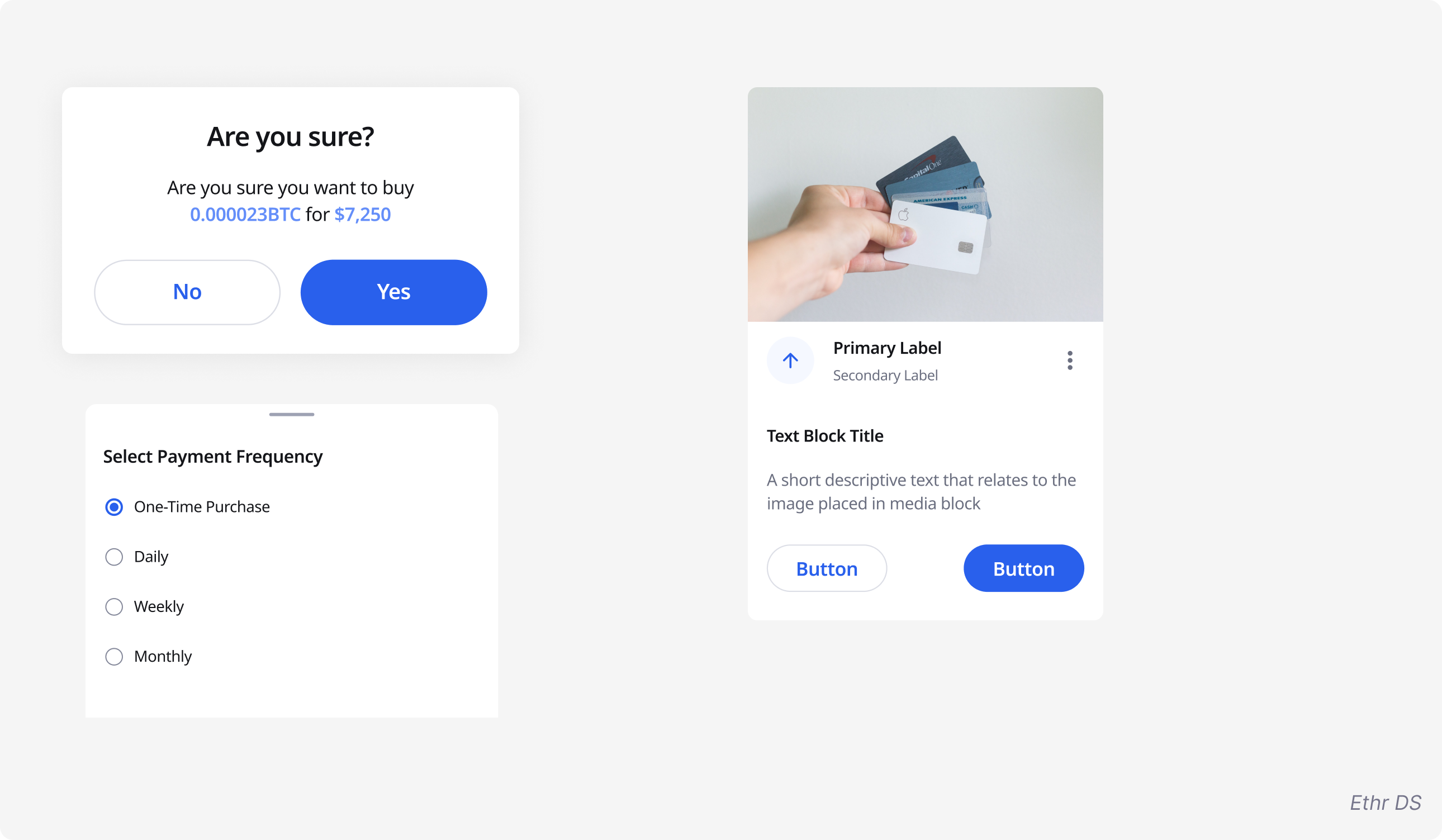
We broke down the atoms into the literal atoms of design and it comprised elements like fonts, color pallet, spacing, shadows, animations, etc. Following is an overview of what the hierarchy level comprised within our system.
Note: Due to confidentiality reasons, none of the original DS elements have been used below. All the placeholder components are the property of Venture Dive (Ehtr Design System) - Kudos to their design team!
Atoms
Components
Organisms
Templates & Pages
Furthermore, Templates and Pages will follow the same modularity as Brad Frost defines the specifics of both levels.
Work in progress
PosterMyWall’s Design System is a heartfelt effort and an ongoing project of two designers. It’d take a bit more time before it gets concluded. But whenever it does, it’ll definitely be a sight to look at, will definitely get a name of its own and I'll for sure share a lot more details about it and update this case study. (づ。◕‿‿◕。)づ
